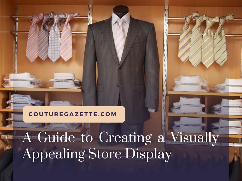
A visually appealing store display is not just about aesthetics, it’s a critical component in a store’s marketing strategy. As you venture into creating enticing store displays, remember it’s about weaving a story and guiding your customers on a journey through your store.
Creating a Visually Appealing Store Display
Understanding Your Brand and Customers
To create a visually appealing store display, begin by understanding your brand and the customers you aim to attract. A great store display should reflect your brand’s personality and appeal to your target customers’ tastes and preferences.
Importance of Window Displays
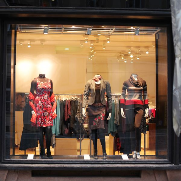
The window display is your first chance to grab potential customers’ attention. Make a bold statement, showcase your best products, or highlight a current sale or promotion. It should intrigue and invite passersby into your store.
The Science of Color and Lighting
Color and lighting play vital roles in creating a visually appealing store display. Bright colors can draw attention, while softer colors can create a relaxed mood. Combine this with strategic lighting to highlight products and create ambiance.
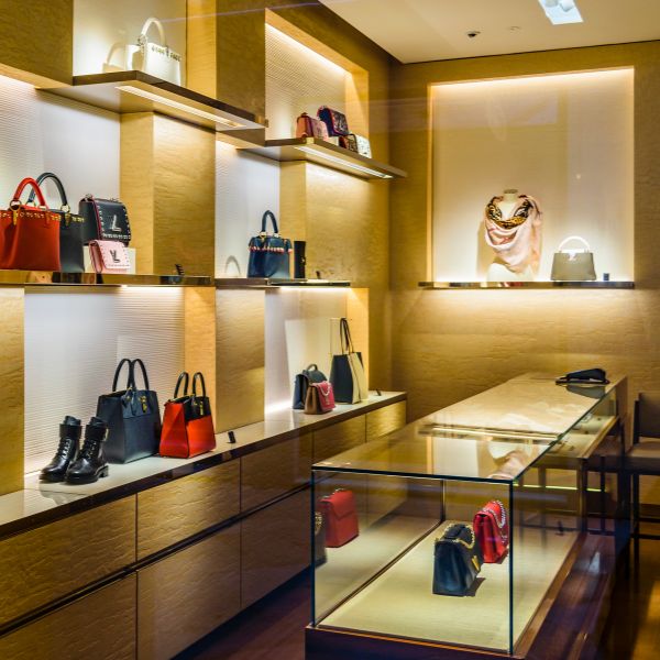
Strategic Product Placement
The way you position your products can significantly influence purchasing behavior. Use the “Rule of Three” to create visually appealing arrangements, and remember that customers naturally look left when they first enter a store.
Importance of Regular Updates
Keep your store display fresh and exciting by regularly updating it. Seasonal changes, new products, or upcoming sales are excellent reasons to revamp your display and keep customers coming back.
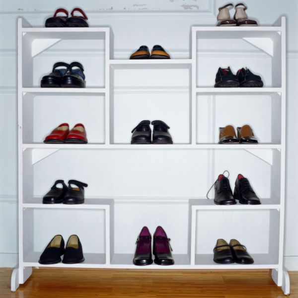
Creating a Path Through Your Store
Create a journey through your store using displays that lead customers from one section to another. This can increase the chance of impulse buying and make the shopping experience more enjoyable.
The Power of Signage
Well-designed signage can enhance your store display by providing necessary information, directing customers, and promoting special deals or products. Keep your signage clear, concise, and in line with your brand aesthetic.
7. Different types of display techniques
1. Window Displays:

Window displays are often the first point of contact between your store and potential customers. A well-curated window display can draw in foot traffic by showcasing new products, sales, or themed collections. They create a visual impact that can stimulate interest and induce customers to enter the store.
2. Point-of-Purchase (POP) Displays:
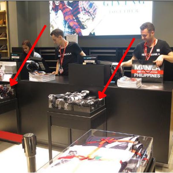
Located near the checkout counter, POP displays often contain impulse buys or add-on items. These displays are critical for driving last-minute purchases as they leverage the customer’s waiting time to draw attention to smaller, often overlooked items.
3. End Caps:
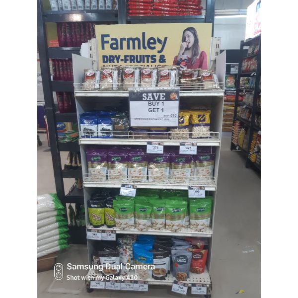
These displays are located at the end of store aisles and are highly visible. They’re often used to showcase promotional items, new products, or seasonal merchandise. End caps have the power to stop customers in their tracks and can significantly boost sales for the featured products.
4. Free-Standing Displays:
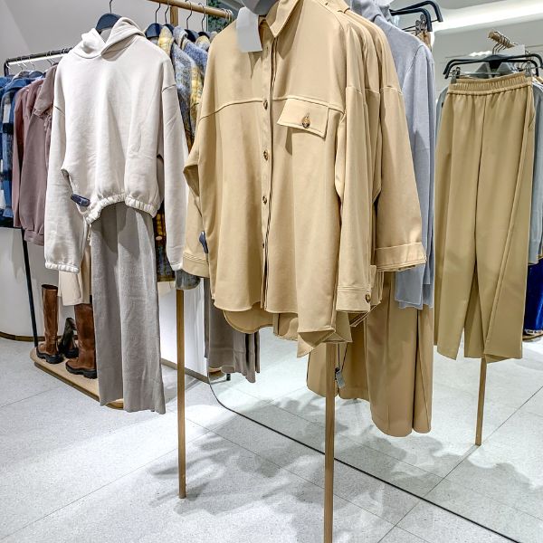
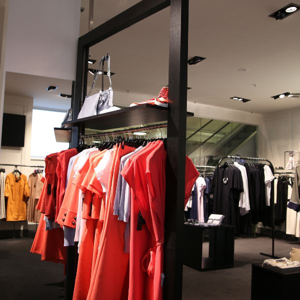
Free-standing displays are versatile and can be placed throughout the store to feature specific products. They’re typically used for promotional items or to create mini-thematic displays within larger store sections.
5. Speed Bumps:

These small displays are placed at the front of aisles to slow customers down and draw attention to specific products. They can be an excellent strategy for promoting new or seasonal items.
6. Interactive Displays:
Interactive displays encourage customers to touch, try, or taste products, creating a more engaging shopping experience. These displays can create memorable experiences, increase dwell time, and drive sales.
7. Dump Bins:
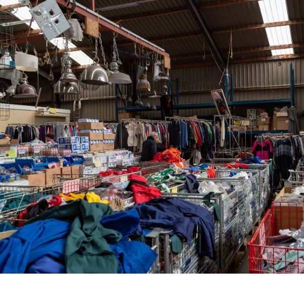
Dump bins are typically used for clearance items or products sold in high volumes. While not the most visually appealing display type, they create a sense of urgency and can effectively move large quantities of merchandise.
Each of these display types plays a different role in your store’s visual merchandising strategy, helping to capture customer attention, create an engaging shopping experience, and ultimately, drive sales.
10 Key Elements of Visual Merchandising
Visual merchandising is not only applicable to brick-and-mortar stores but can also be translated effectively into an online context. Here’s how these elements can be applied to your online boutique:
1. Website Layout:
Your website layout should be clean, easy to navigate, and aesthetically pleasing. Make sure that your products are organized into clear categories, and use filters to help customers find what they’re looking for.
2. Homepage Display:
Your homepage is the digital equivalent of a store window. Feature new arrivals, best-sellers, or seasonal items on the homepage to attract customer attention.
3. Color:
Color helps convey your brand’s personality and can influence customers’ emotions and buying decisions. Stick to a consistent color palette that aligns with your brand and use it strategically throughout your website.
4. Lighting:
In an online context, lighting translates to the quality of your product photography. Ensure your products are well-lit and presented, as clear and appealing images can significantly influence buying decisions.
5. Signage:
Digital signage includes banners, headers, pop-ups, and call-to-action buttons. They can guide navigation, promote offers, and provide information. Keep your messaging clear, concise, and visually consistent with your brand.
6. Space Management:
In digital terms, this means avoiding a cluttered and overwhelming website design. Ensure there’s ample white space around products and text to make your website more comfortable to browse.
7. Product Grouping:
Organize products in a way that makes sense to your customers. This might be by collection, color, price, or theme. Well-curated product groupings can inspire customers and make their shopping experience enjoyable.
8. Interactive Experiences:
Online boutiques can provide interactive experiences such as 360-degree product views, virtual try-on features, or chatbots for personalized recommendations. These elements can enhance engagement and make shopping more enjoyable.
9. Aesthetics and Branding:
Maintain consistent branding throughout your site, from the color scheme and fonts to the style of photography. This creates a cohesive visual experience that strengthens your brand identity.
10. Cleanliness and Maintenance:
Maintaining a clean, functional website is essential. Regularly update your site with new products, fix any bugs or broken links, and ensure your site loads quickly for a seamless customer experience.
By effectively translating these visual merchandising principles to your online boutique, you can create an engaging, enjoyable shopping experience that not only attracts customers but also encourages them to stay longer and make a purchase.
Conclusion
Remember, your store display is an opportunity to tell your brand’s story and create a memorable shopping experience. Every decision, from color to product placement, should align with this story and your brand’s overall vision.

